We found the following Tips on How to Improve Website User Experience from Hub Spot. If you need advice on how to improve your website user experience you can find the article below with some helpful links.
Your website is the core anchor for your digital marketing efforts. To guarantee that your clientele receive the best experience when browsing, it is important that you are aware of the different problems users have.
Your website is the best salesperson. They work 24 hours a day and provide consumers with the appropriate information that is relevant to their search.
1. Use White Space:
Clients tend to complain to the designers of their website that there is too much white space throughout a page. White Space is a section of a page that is not being used. However, having this empty space can be a positive to a website. It can encourage a viewer to devote all of their attention the content and distinct designs and color that surround the text. To view what effective white space looks like on a website, click here.
2. Optimise your page speed:
It is frustrating when a web page or an image doesn’t load as fast as you would like it to. If your website doesn’t load within five seconds, bounce rates will increase. But, there are multiple solutions that will help to decrease those rates. For information on how this can be achieved click here
According to Section.io, bounce rates will increase by 20% if there is an extra five seconds of page load time. Google offers a free service that is reliable and will give you the relevant information about your page speed.

3. Use images (wisely):
Before browsing through a website, people are beginning to judge the company sites appearance. It is important that the images displayed have been taken in your company if not being taken off the internet.
Images are used to convey your brand and its products and services the way that you want it to. Customers should be able to visually perceive what your company is about. Looking at the site of https://www.octacom.ca/, we are immediately informed of the services they provide. Check out this infographic on real images vs stock photography.
4. Include well-designed and written headings:
The words used in headings and content included on your website is based off what consumers have an interest in.
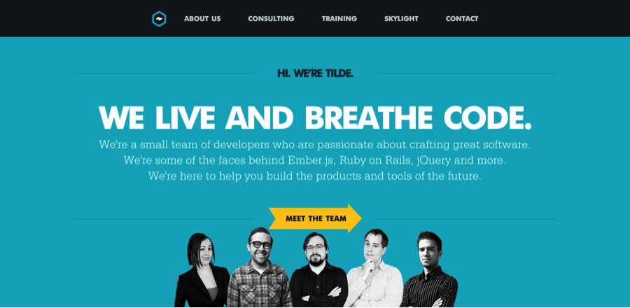
The important thing to remember about headings is that they act as a guide for users of a website, making it easier for them to find the information they acquire about a product or service you provide. For example: a company called Tilde have well-designed headings that are attractive on the homepage of their website as you can see below. The colour used is well balanced and the font size doesn’t take the attention away from the other features. To view Tilde’s website follow the link provided here: https://www.tilde.io/.

5. Segment key information with bullet points:
When writing up a business document or content for a website, it is recommended to use a bullet pointing format where there is a substantial amount of information.
Bulling pointing is a great way for highlighting important information and is more appealing in the eye of the reader. This format allows the user to brows through a page in a short amount of time and collect all relevant points of information more efficiently. Another effective way of drawing attention to information on your website is to use icons relevant to the subject. An organization called One.org. uses icons as the bullet points to highlight their what they have achieved over a period of time as shown in the image featured below. Often using icons can make the topic of conversation that little more interesting and worth the time to explore.

If you have any inquiries about the services at Blueberry Design click here or call us if you have any questions on (041) 986 5686.


